Test Dashboard Web APP
Turning a clunky test dashboard into a clear, actionable developer tool
Context
A company-wide shift toward developer experience, an internal survey reveals that the Test Dashboard App was difficult to navigate and overwhelming to read, paired with a rebranding and a new design system, made this the perfect candidate for transformation.
My Contribution
As the lead designer driving the end-to-end UX process—from user research and information architecture audits to detailed UI design and usability testing. Led design reviews and collaborated with PMs/engineers and validated through A/B testing and stakeholder feedback.
Impact
The redesign turned an outdated interface into a streamlined, insight-driven experience that reduced time to diagnose test failures by ~37% and significantly boosted adoption of the System Run feature.
Timeline
2024.10 - 2025.2 (4 month)
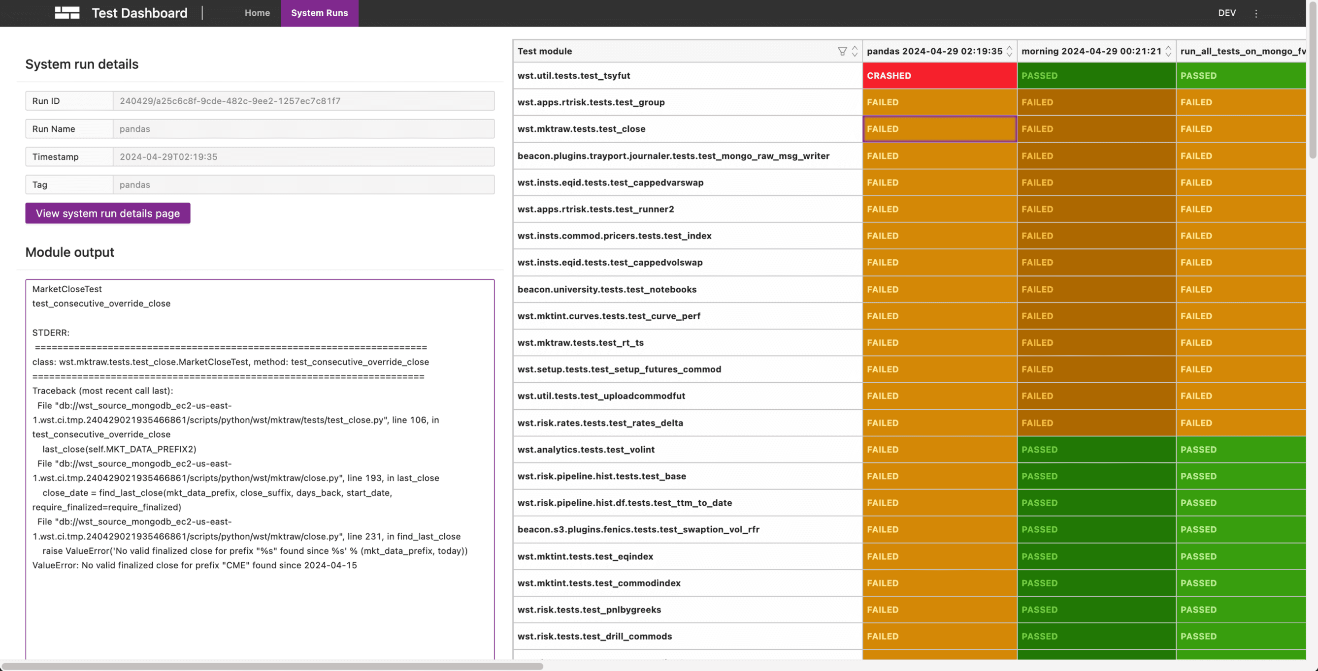
Before
After
Background
Why we are redesigning Test Dashboard?
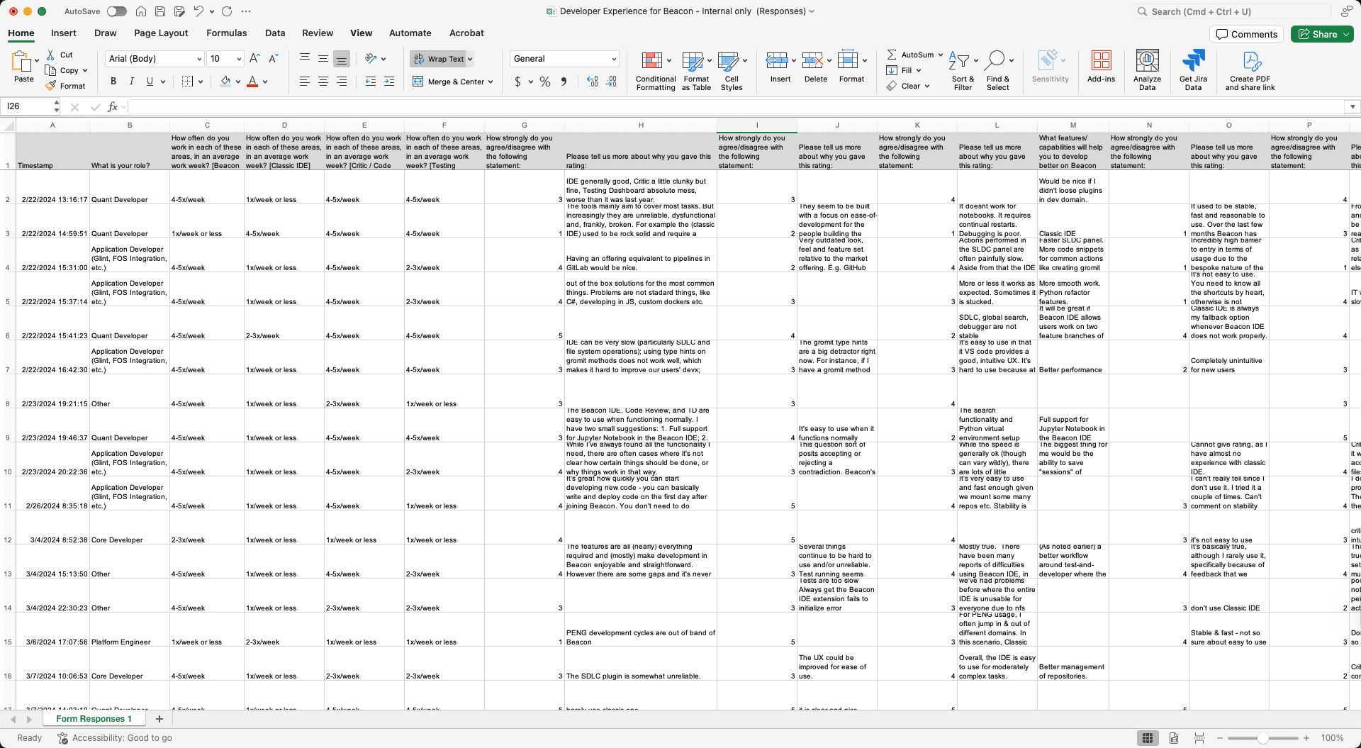
A company-wide shift toward developer experience, to understand user’s pain points and need, we put together a survey to gather feedback and thoughts from internal users.
Some Quotes from Survey
“IDE is generally good, Code Review is a little clunky but fine, Testing Dashboard is absolute mess, worse than it was last year.”
“Test Dashboard are very clunky, unintuitive, feature-poor and suffer from bad UX.”
“It seems to be built with a focus on ease-of-development for the people building the tools, not using the tools.”
”
Background
What is Test Dashboard?
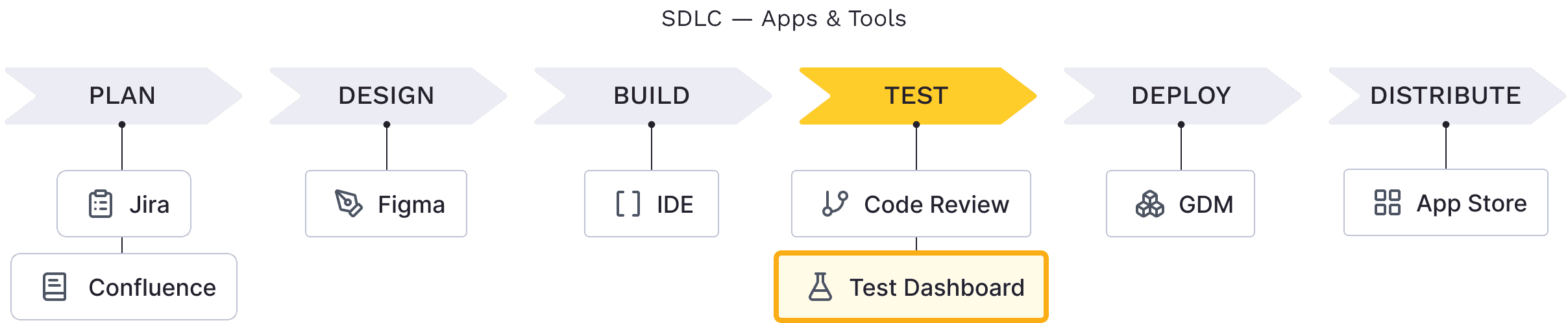
Test Dashboard is an internal developer tool that centralizes test results, enabling engineers to monitor, compare, and troubleshoot both their own test runs and automated system runs—an essential step in the testing phase of the Software Development Life Cycle (SDLC).
Pain Points
Problem
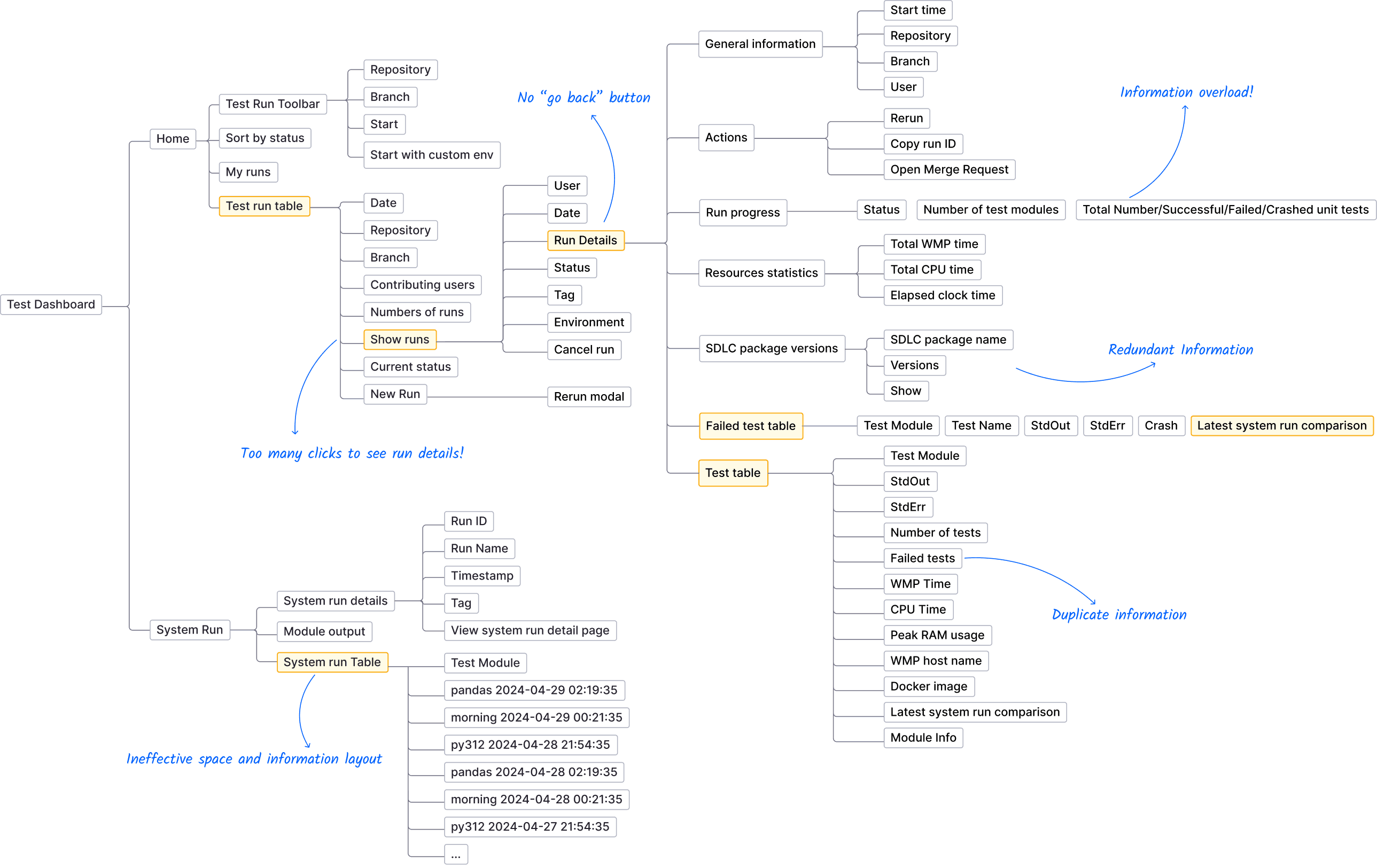
IA & Pain Points
Solution
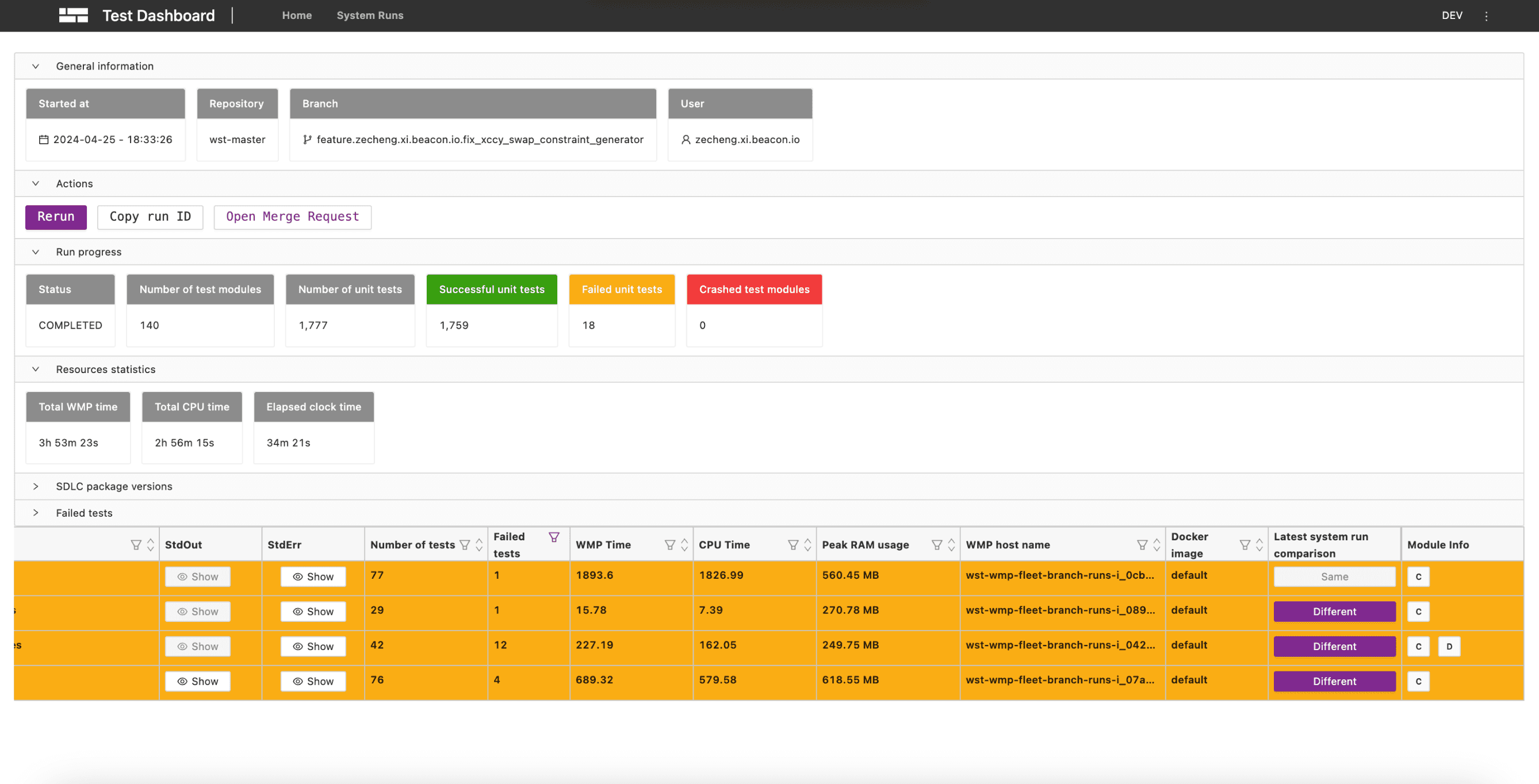
System run page redesign
Before
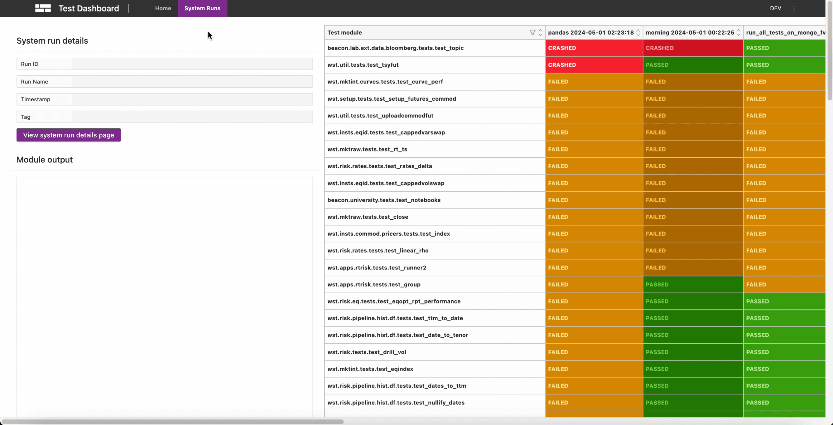
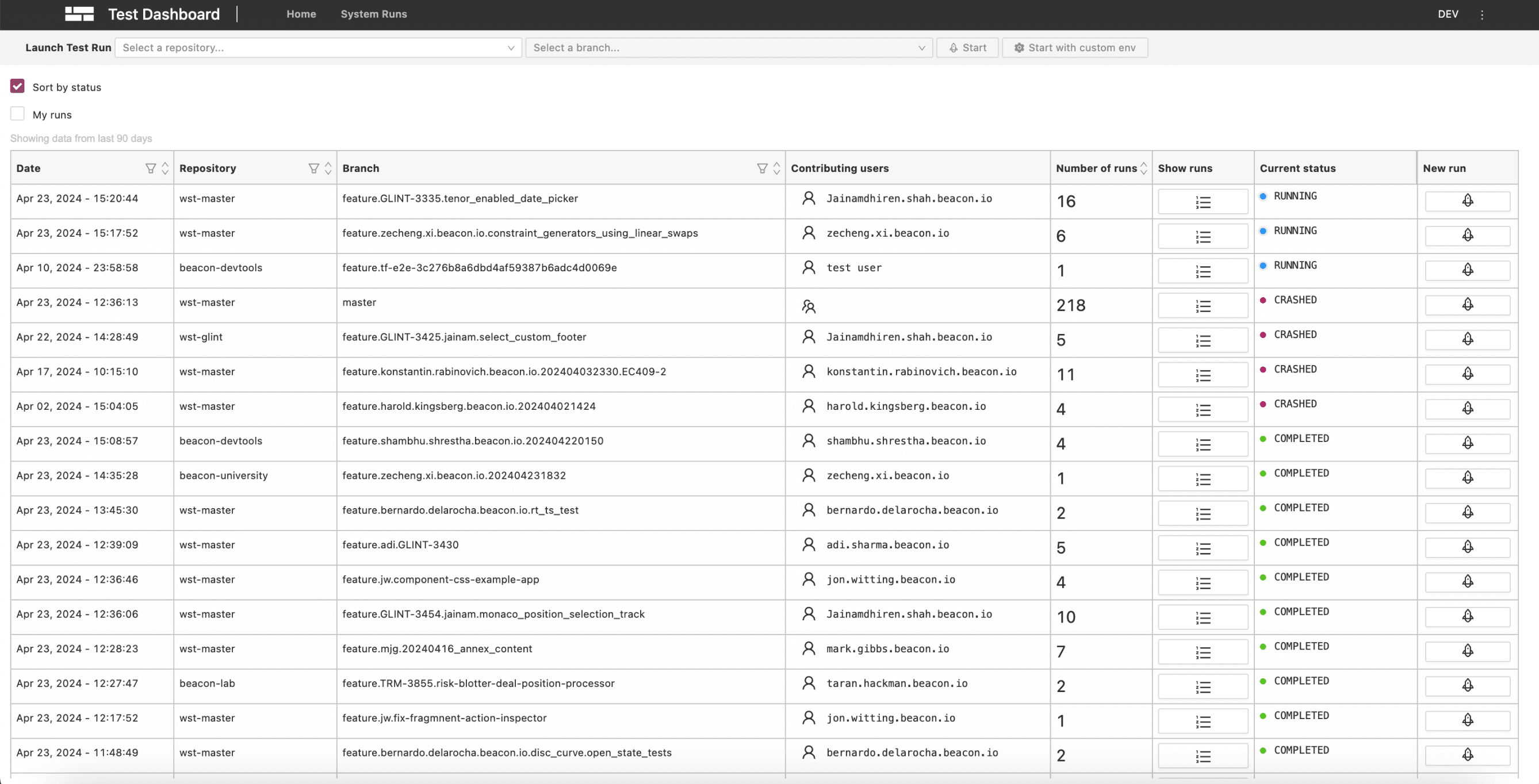
Ineffective space and information layout
Large, hard-to-read table
A lack of visual insight into trends
Complex filtering workflow
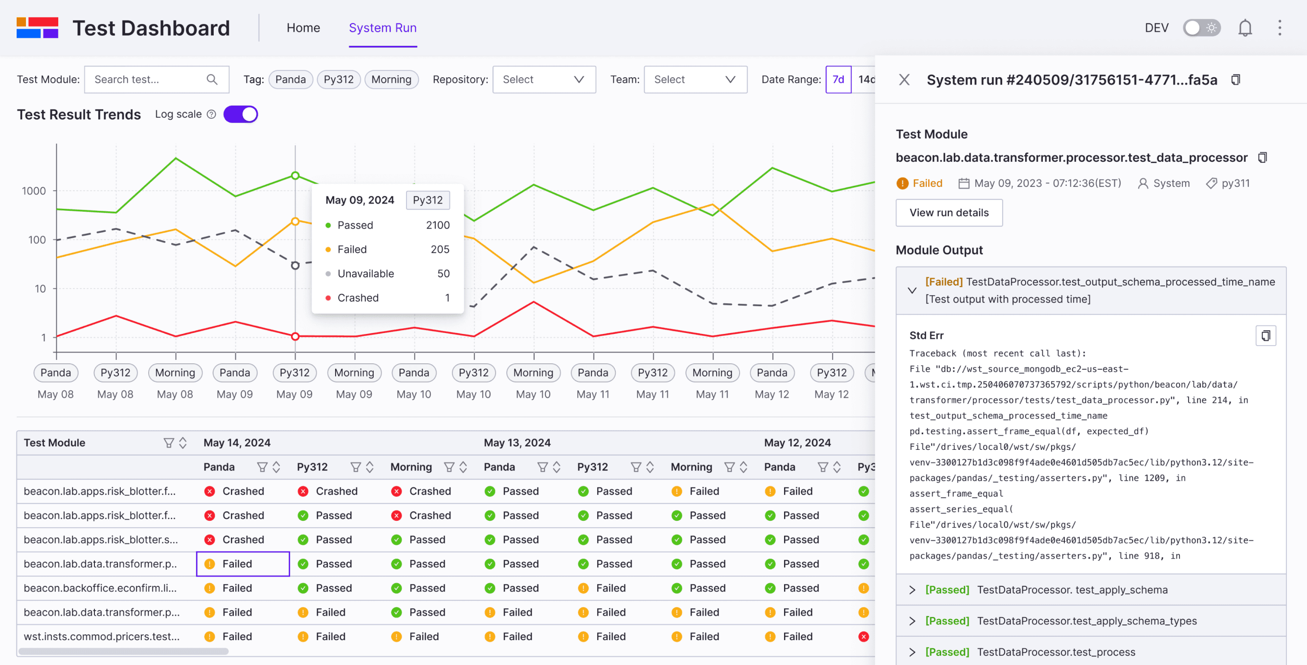
After
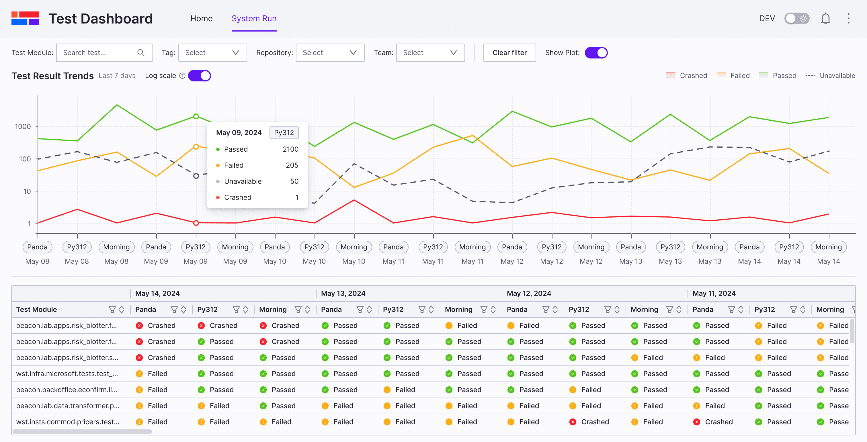
Quick Filter System
Clear table with clarity and simplicity
A line chart to visualize trend data
Effective space and information layout
Challenge Deep dive
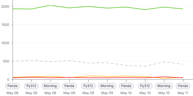
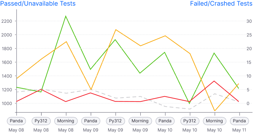
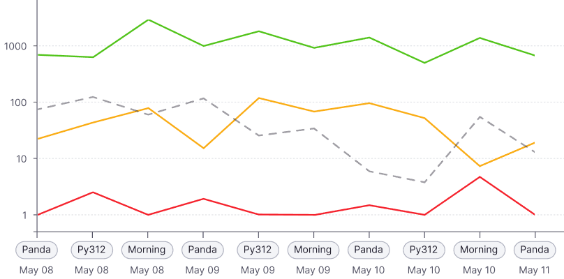
Problem of line Charts
In real scenarios, the number of passed runs typically exceeds 1,000 (sometimes over 2,000), while failed or crashed runs are usually fewer than 100.
Normal scale: Failed/crashed are barely visible
Dual Y-axis: Confusing
Log scale: Clear insight
Solution
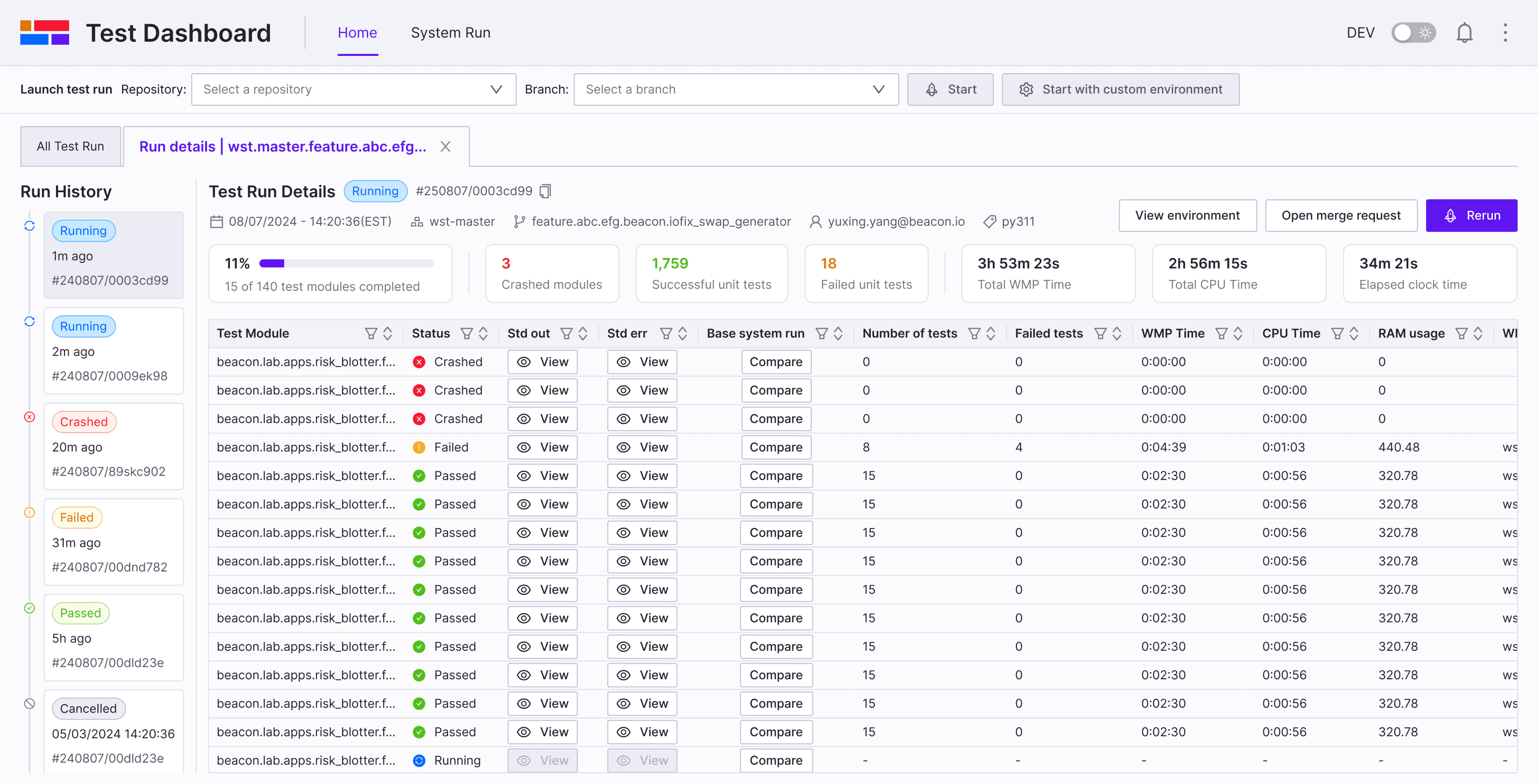
Home page navigation
Before
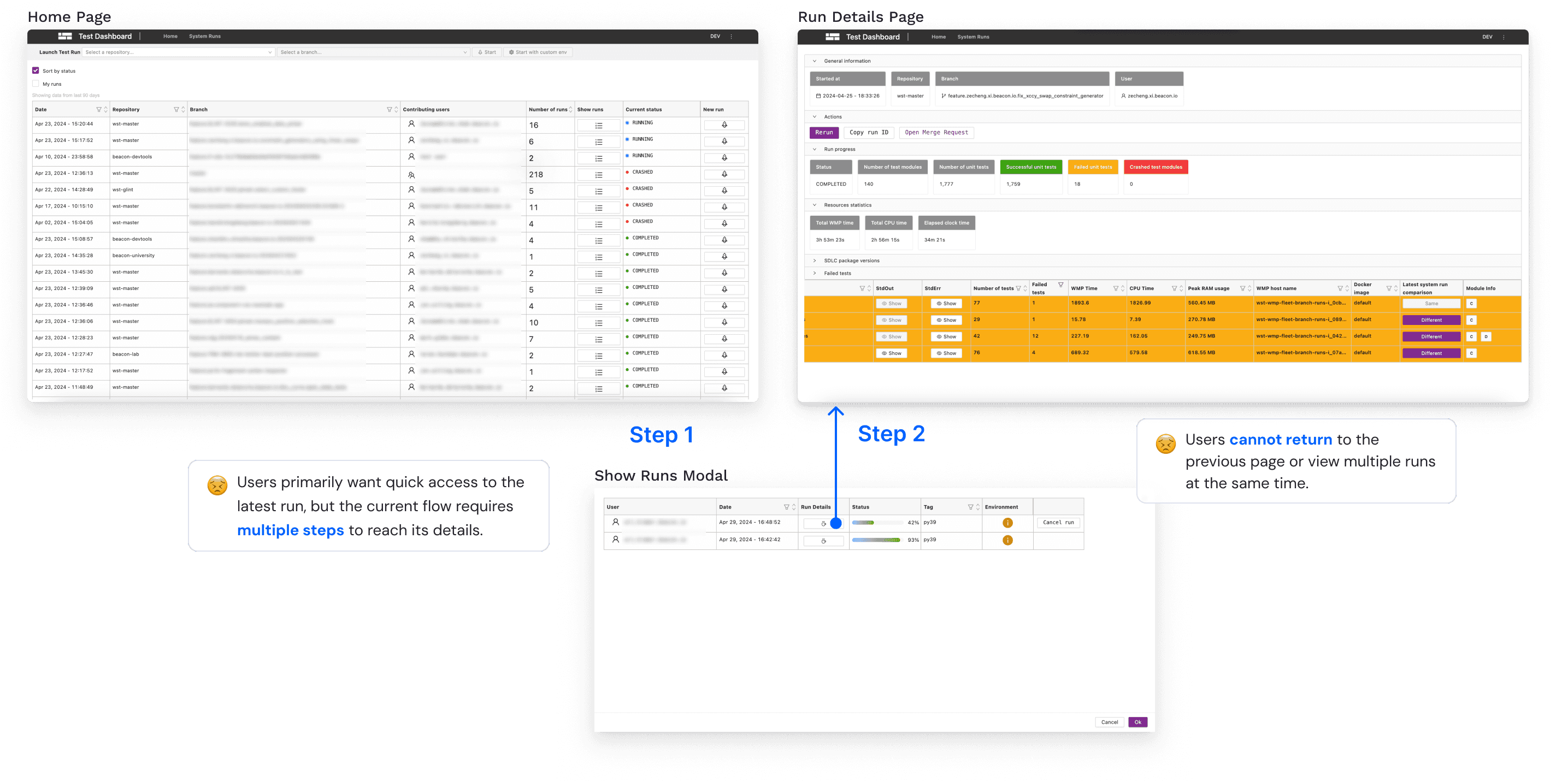
After
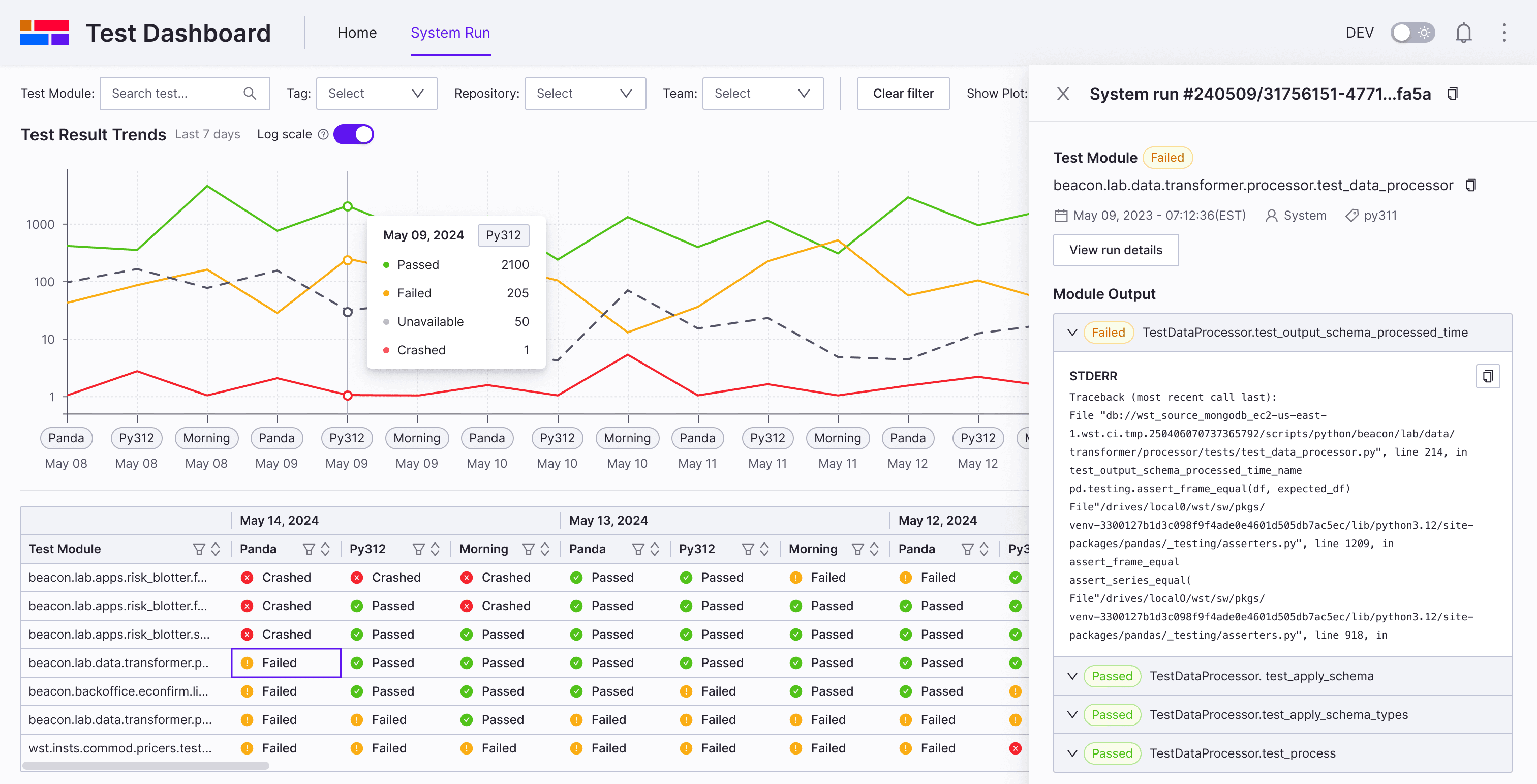
Home page
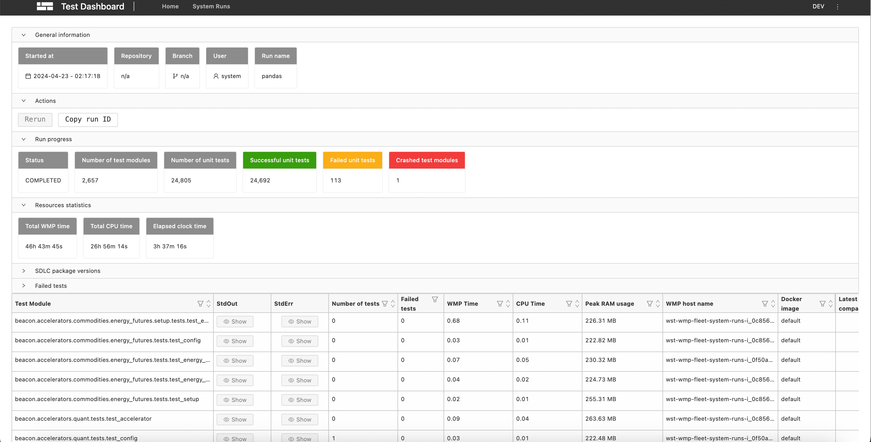
Run details page
💡
💡
💡
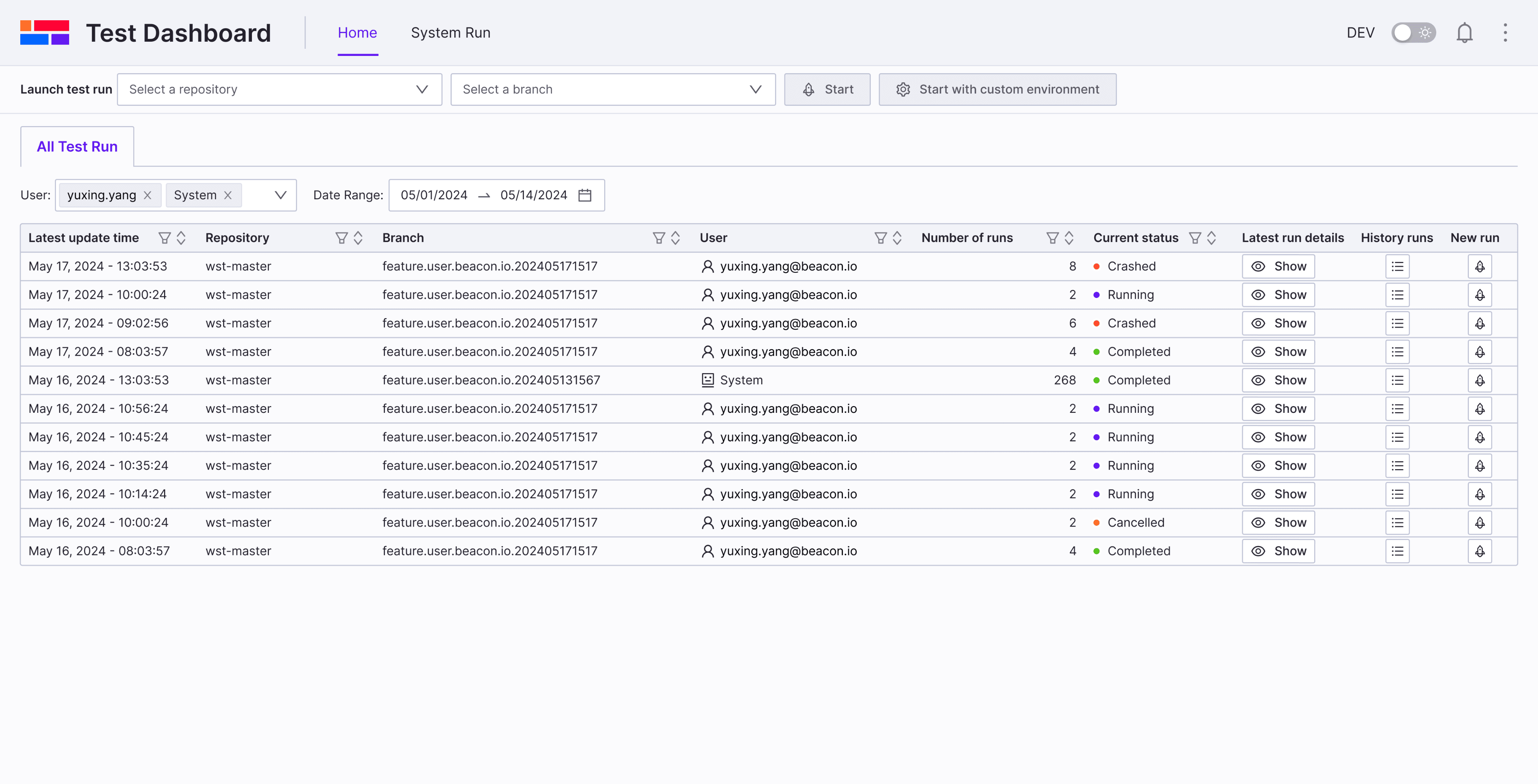
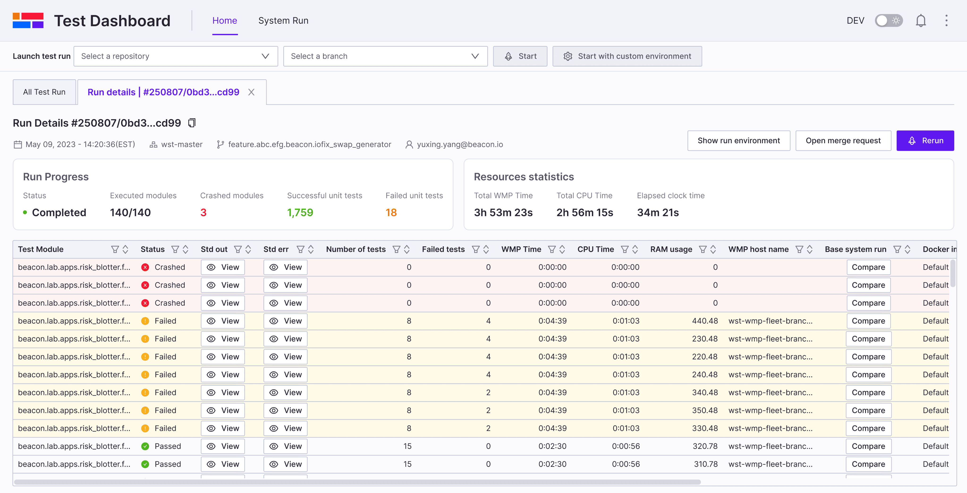
Run details page iteration
After designing the new navigation and run details page, I conducted usability testing with internal developers who participated in our initial user interviews.
Before iteration
Key feedback from usability testing:
Tab names are hard to distinguish.
Navigating historical runs of the same feature branch remains difficult
After iteration
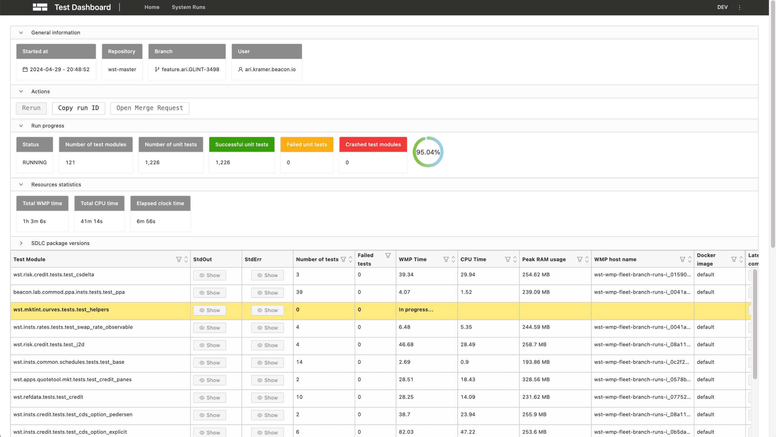
Run history timeline: Enables easy navigation across historical runs in the same feature branch
Repository and branch based tab naming: Makes runs easy to distinguish
Single stats card: Consolidates key information, including a progress bar for run progress
Challenge
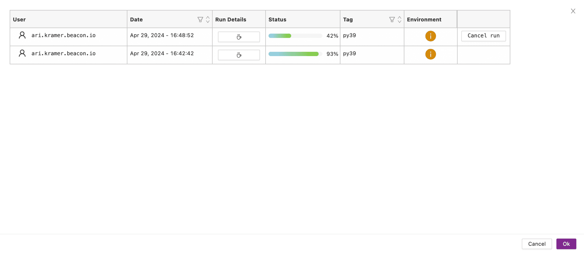
Problem of Run Comparison
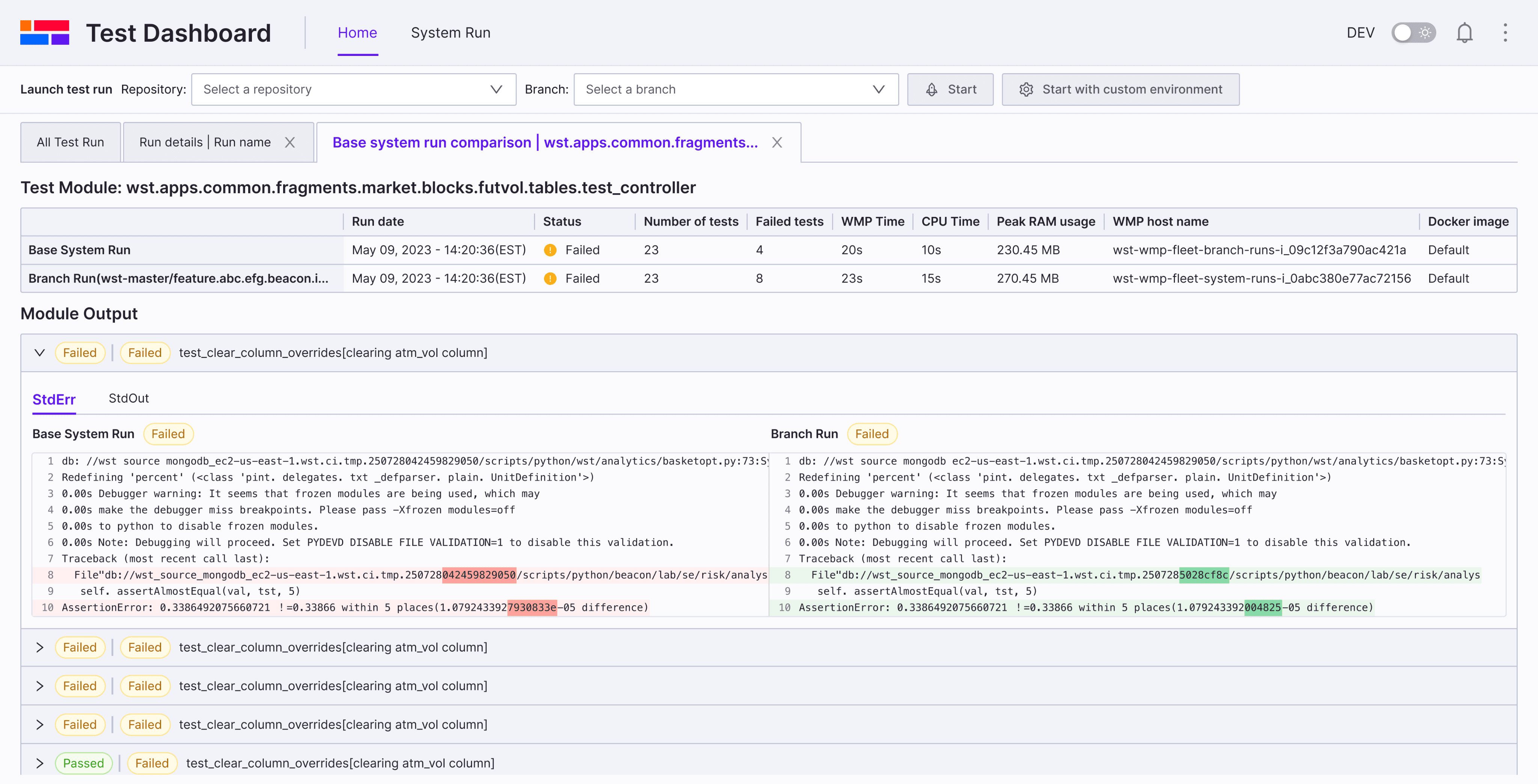
Before
Branch Run details
System Run details
😣
Usability Testing
An ideal layout is that user can compare the branch run and system run side by side. I tested different layouts and provide three options to conduct usability Testing with internal developers.
Run comparison page
Option A
PRo
Easy to compare results
Compact, space-saving layout
Supports future scalability
COns
Not aligned with the module output layout below
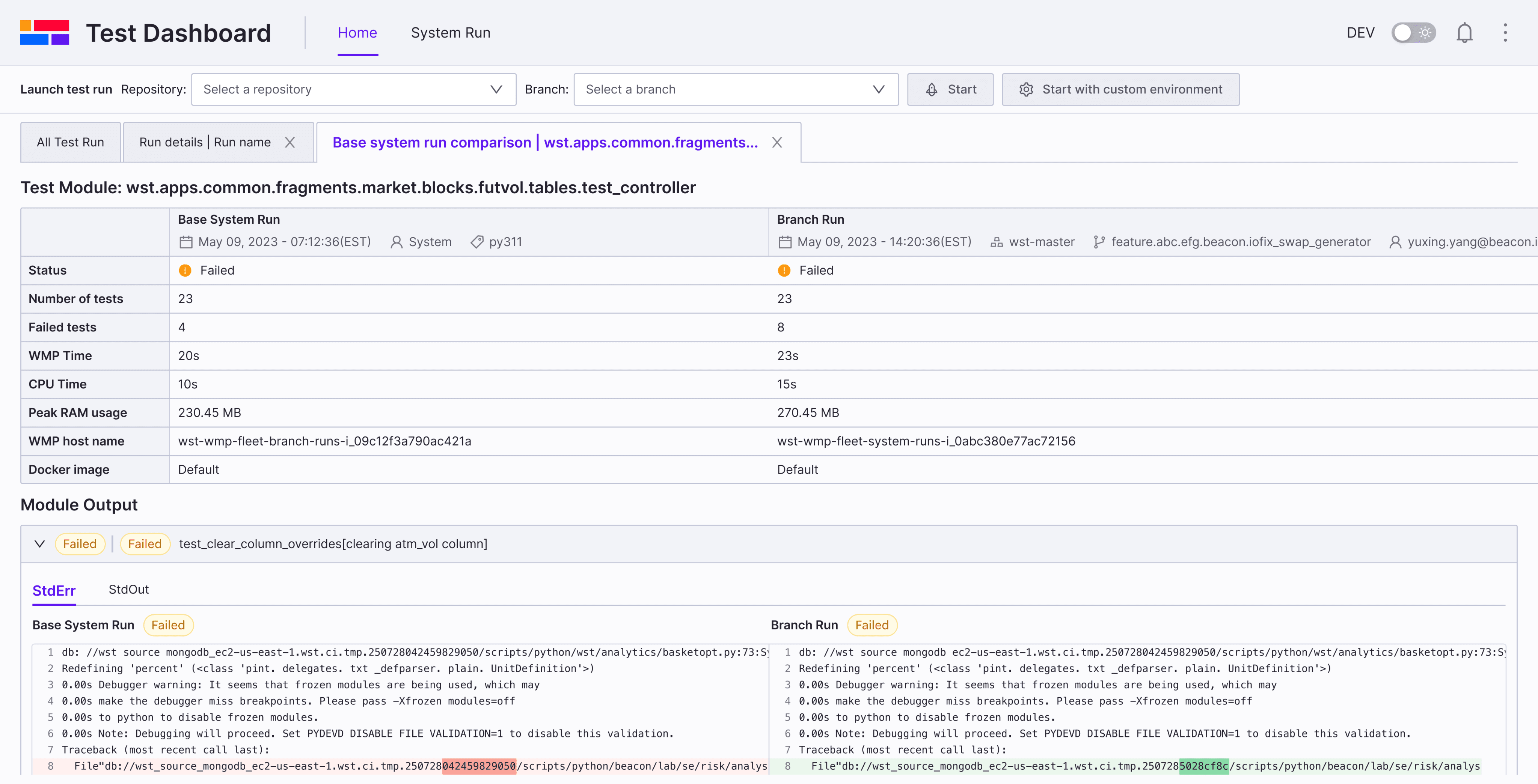
Run comparison page
Option B
PRo
Matches the layout of the module output
Supports future scalability
COns
Comparison table takes up too much space
Run comparison page
✅
Option C
PRo
COns
Limited scalability for future needs
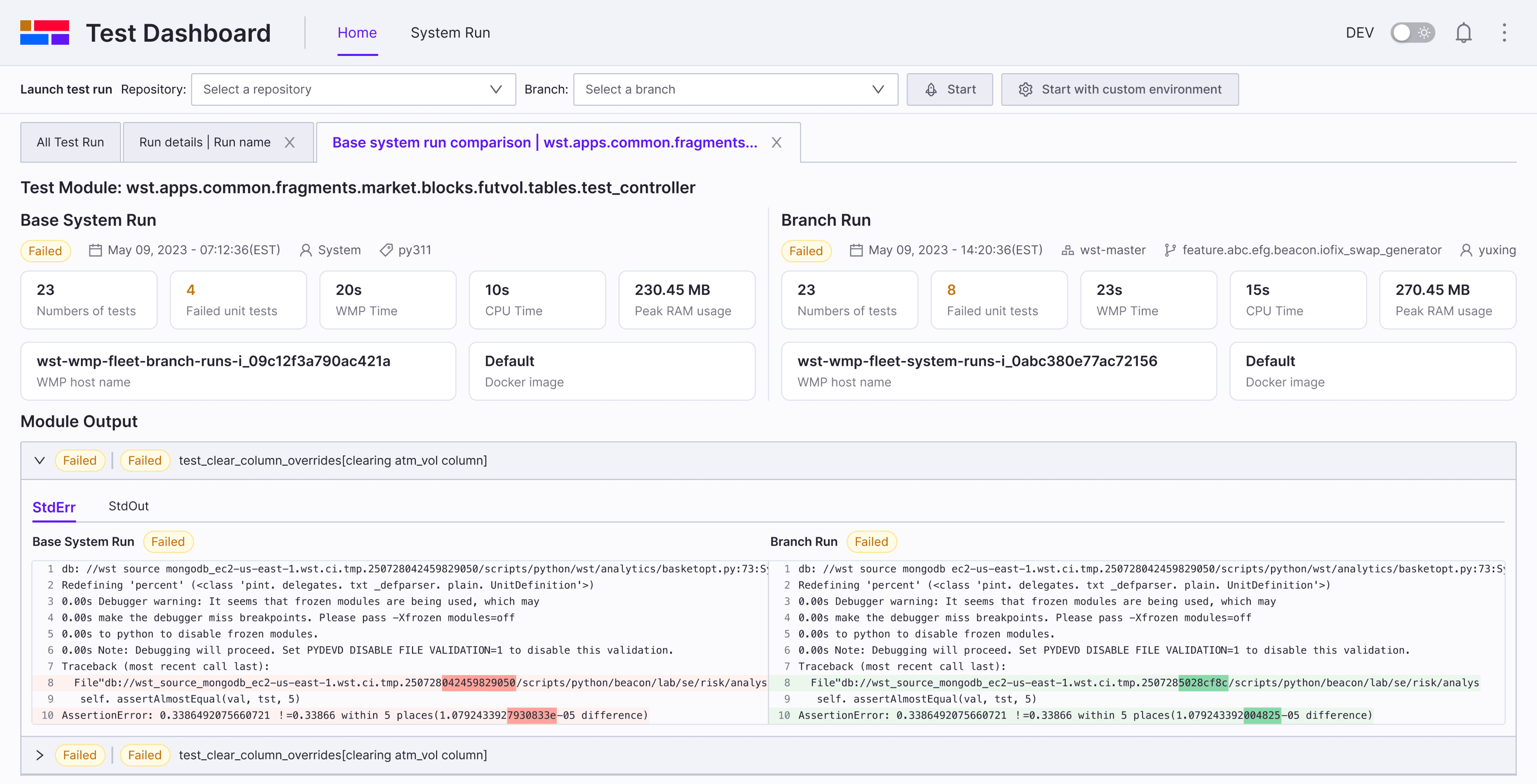
Final Decision
Outcome
Impact
~37% faster failure diagnosis (internal feedback)
Helped prioritize UX investment for other internal tools
“Even small changes made a big difference”
Reflections
Takeaways & Next Steps
What I learned
Next Steps