Trade Blotter Event Viewer
Transformed complex trade events into a scannable, decision-ready timeline
Context
Event Viewer, a key feature within our Trade Blotter APP, gives users a chronological view of all actions throughout a deal’s lifecycle—helping them trace changes and understand their impact on books and counterparties. To enhance user experience and improve efficiency when investigating trades or comparing deals, the Event Viewer was redesigned with a clearer flow and a more intuitive interface.
My Contribution
Led the end-to-end redesign of the Event Viewer. Quickly learned complex trading workflows and worked closely with PM and engineers to release the redesign in stages, ensuring smooth adoption. Designed flexible patterns that scale across different trade types.
Impact
The redesign reduced event analysis time by ~30%, increased repeat usage of comparison by 20%, and strengthened user trust by giving them a faster, clearer view of trade events.
Timeline
2024.5-2024.7
Project challenge
Domain ramp‑up
Limited research
With no formal research budget and no direct access to clients, I relied on assumption logs, quick desk validation, and hallway testing with five internal users after each iteration.
Data complexity
Given the variety of event types—many of which don’t fit neatly on a single rail—I prioritized the most common event paths for the MVP. Edge cases were documented for v2 clustering.
Pain Points
Problem
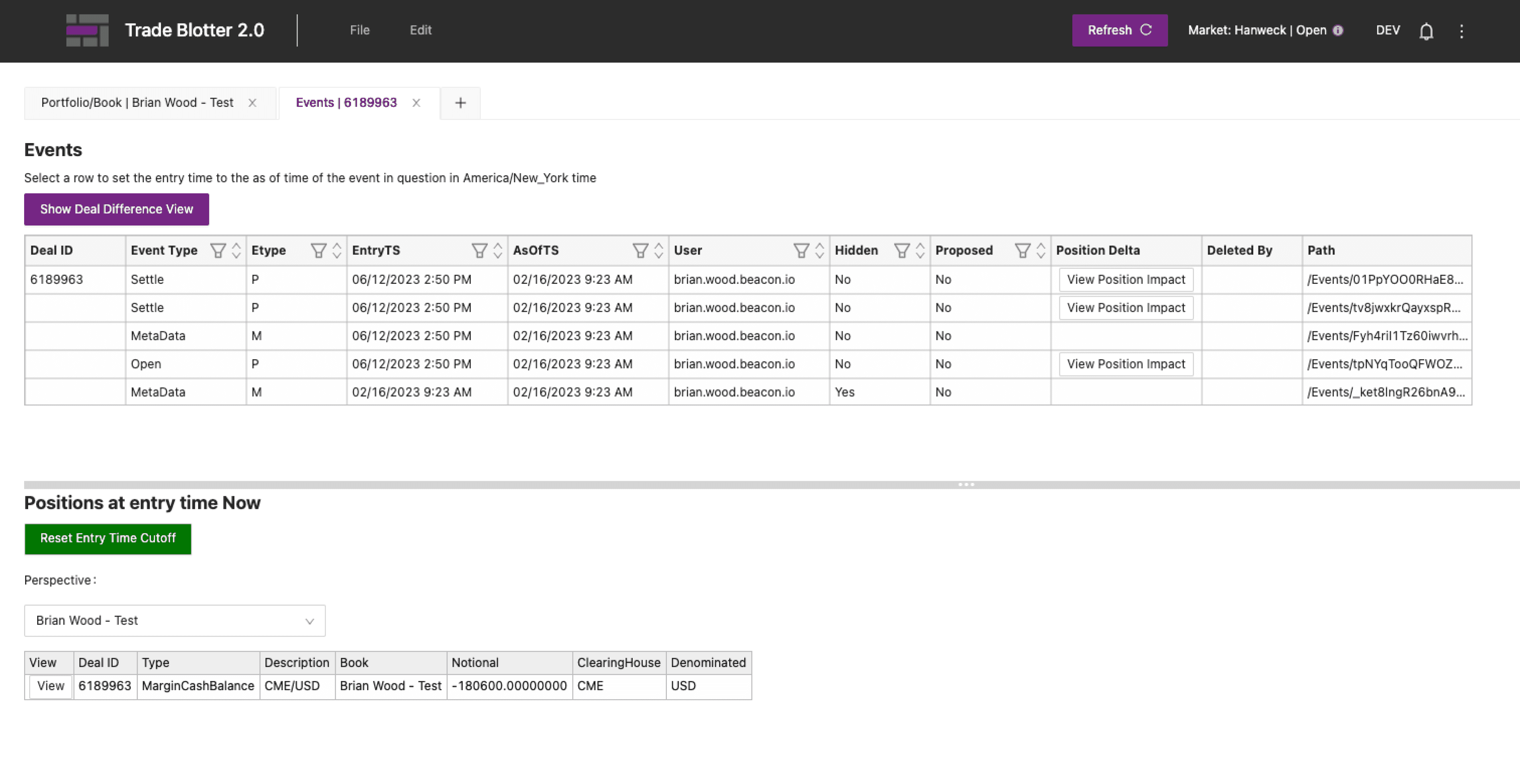
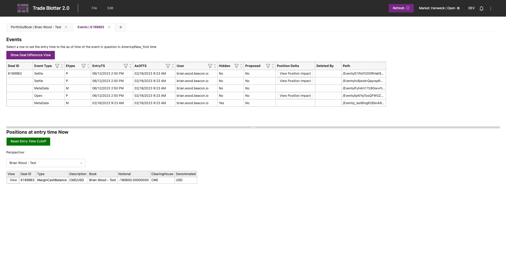
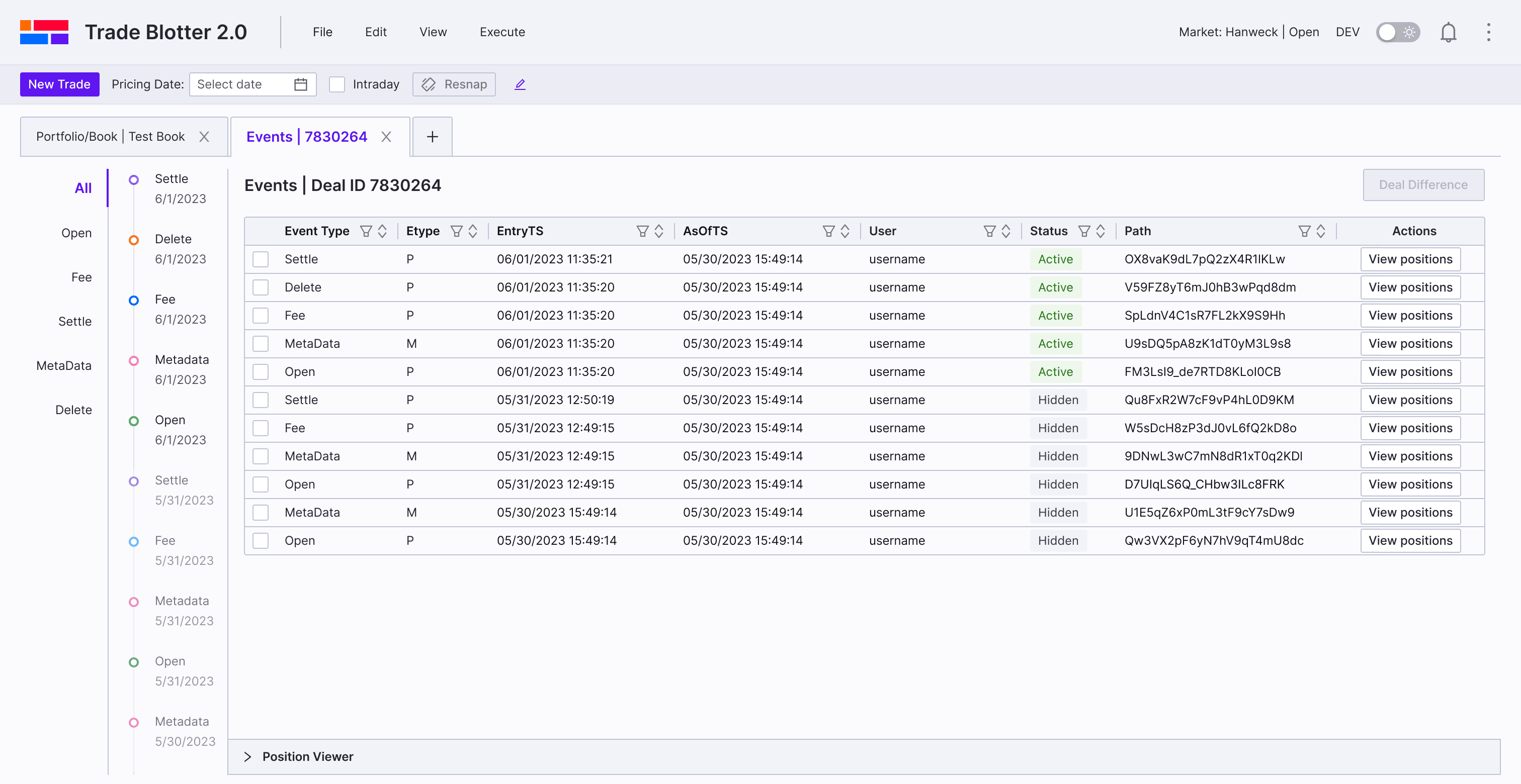
The current event viewer shows all events in a flat table, making it hard to filter, trace relationships, view position impacts across events, or compare differences—causing friction for traders, portfolio/risk managers, and compliance users.
Filtering same-type events is cumbersome
Deal difference comparison is multi-step and fragile
Relationships across event types are opaque
Only single-event position view
Events are all piled together and overwhelming
💡
Design Vision Statement
Solution
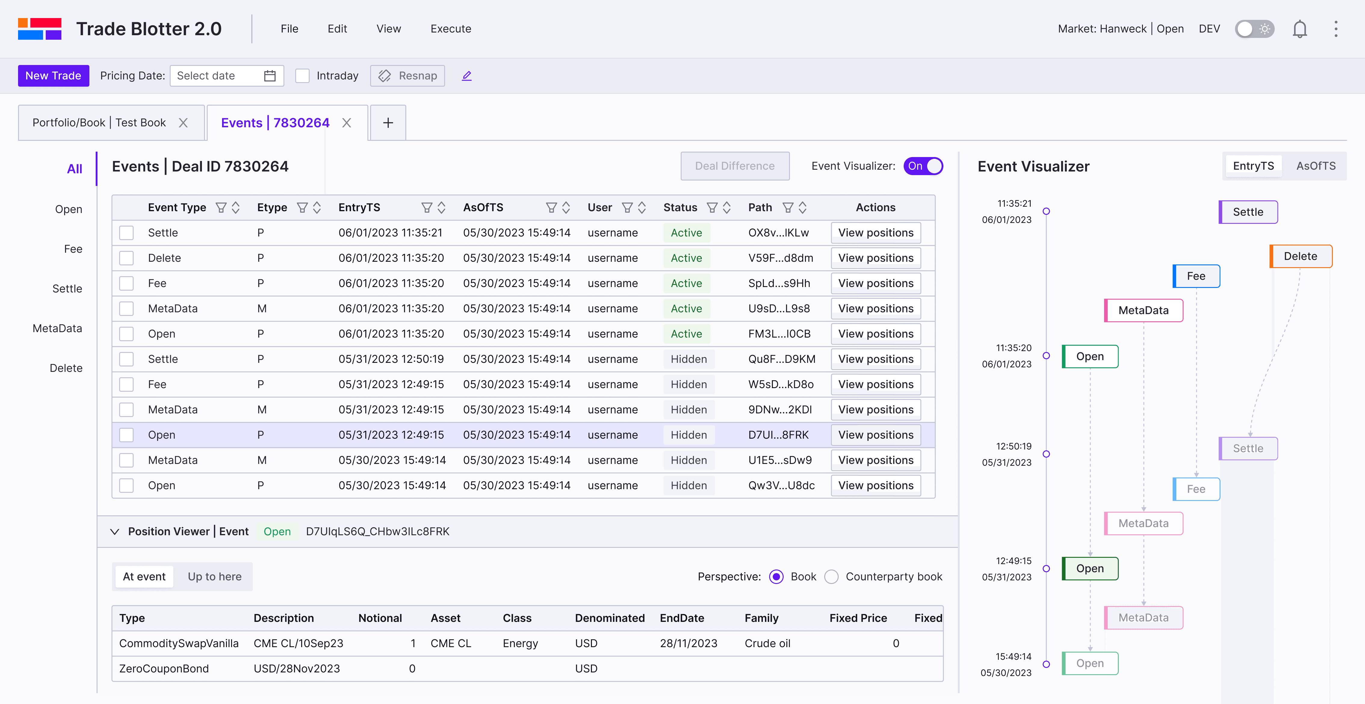
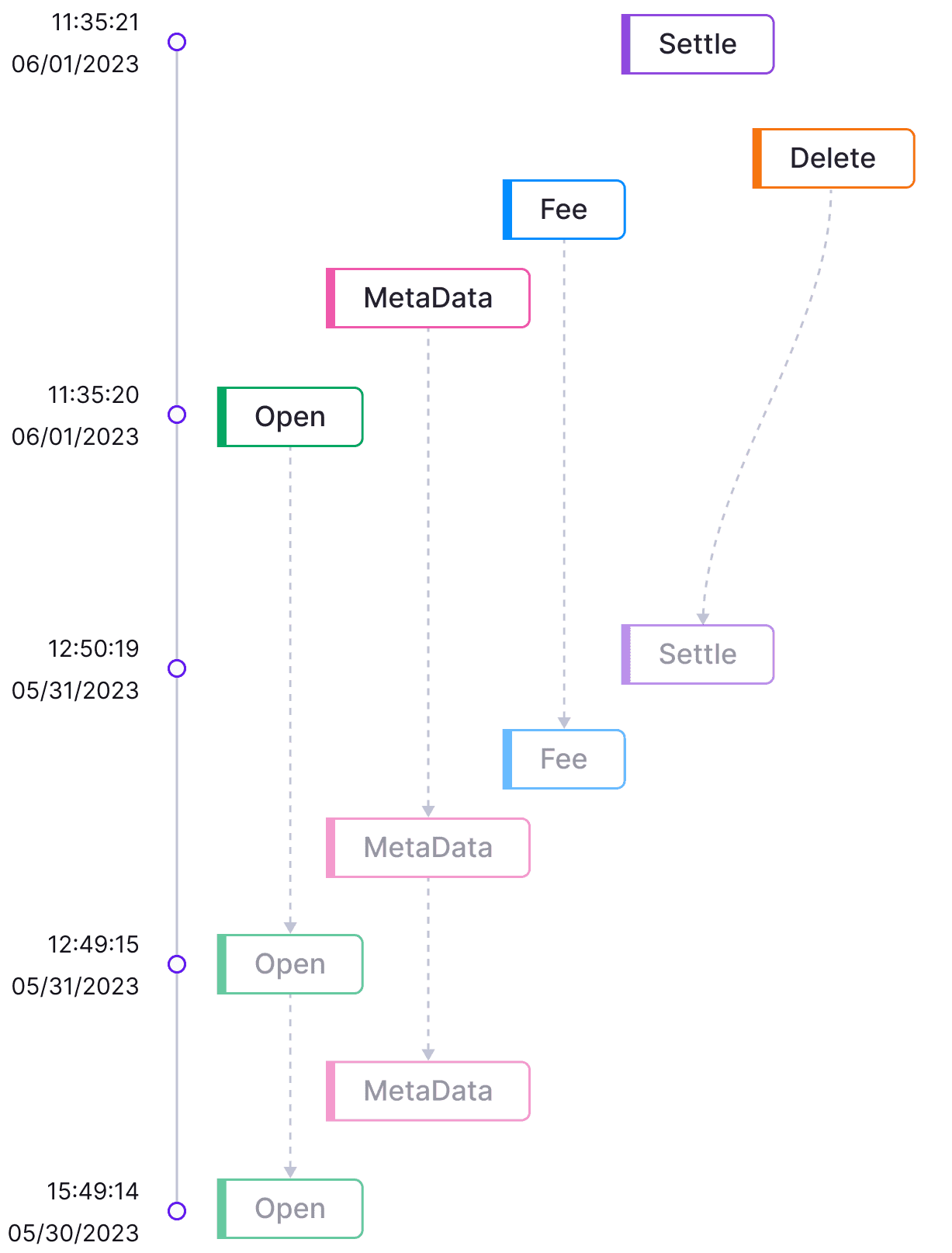
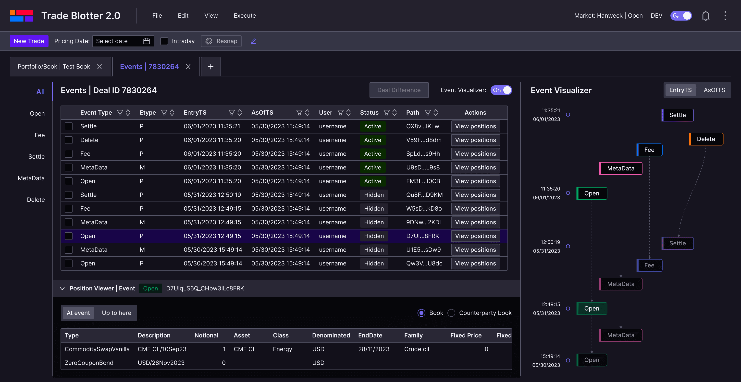
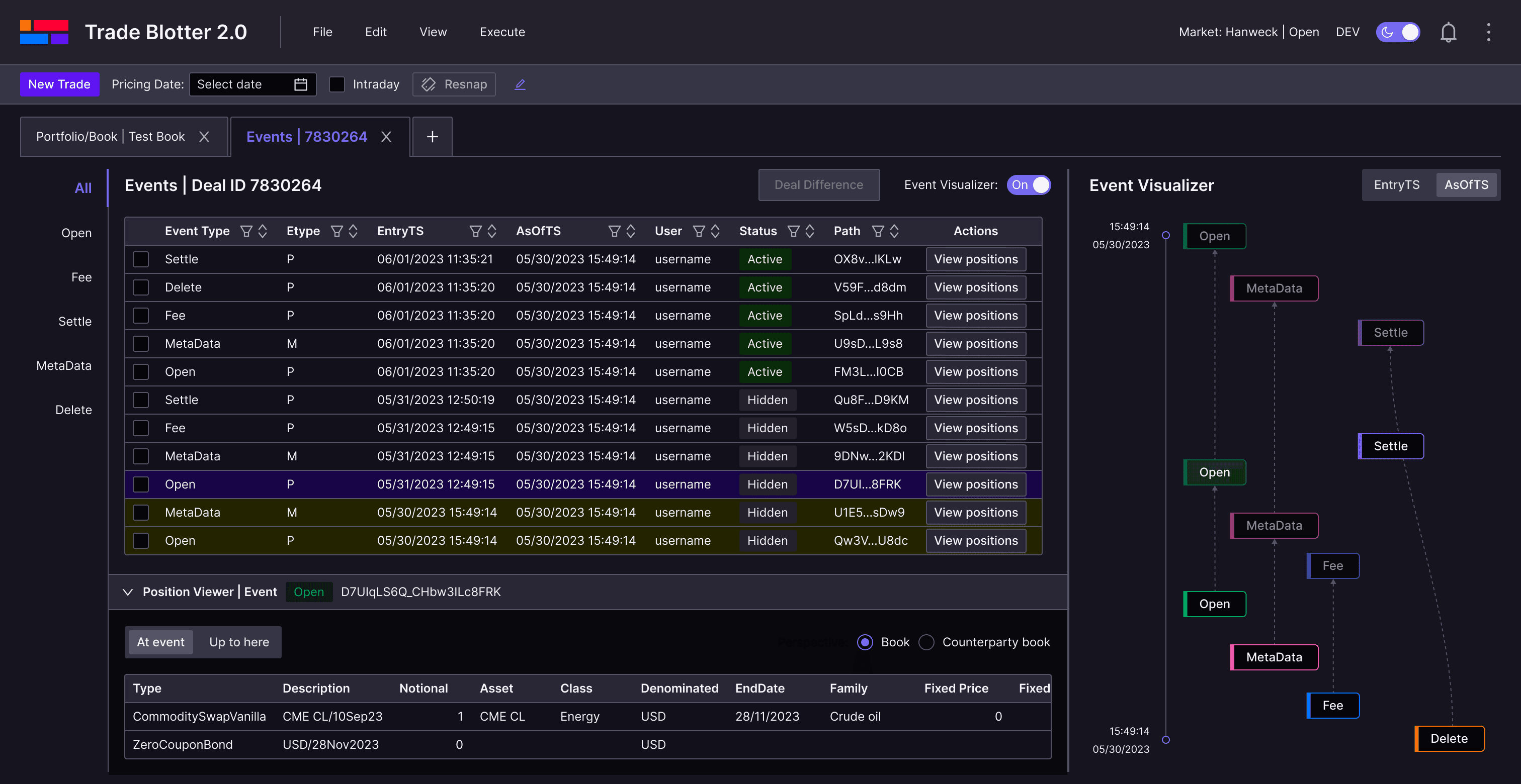
Timeline visualization
Side panel with tab navigation:
Group and filter events by type, improving clarity and scalability across different trade instruments.
Color-coded timeline
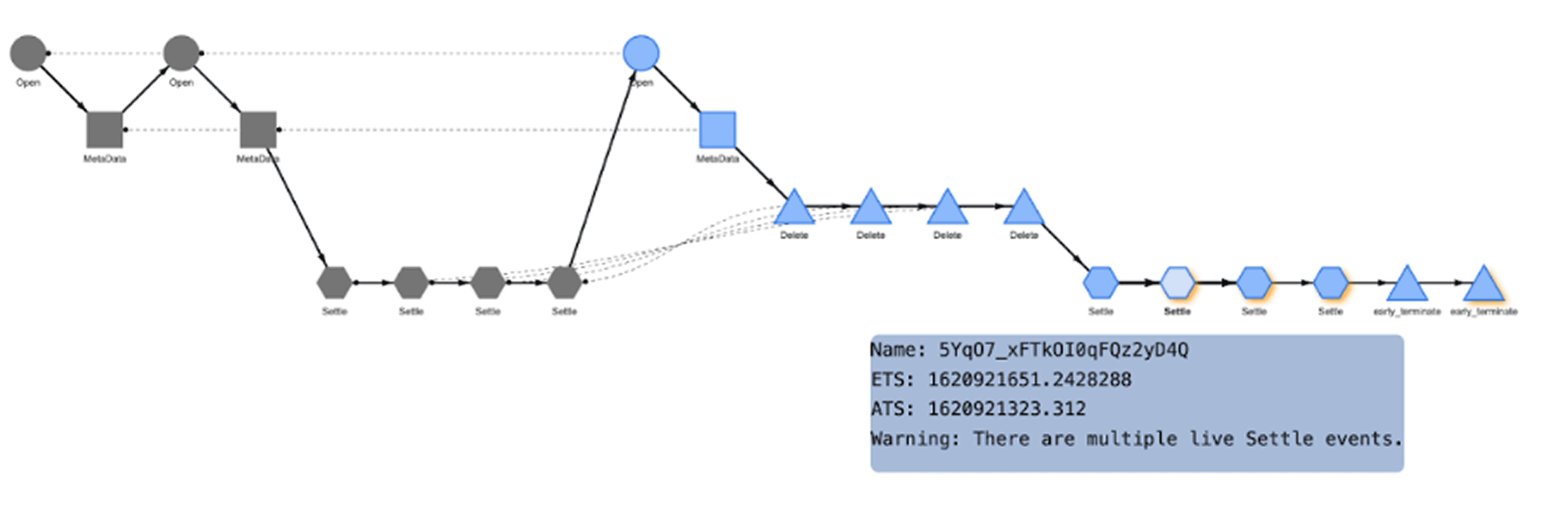
Inspiration from the Engineer’s Demo
One engineer proposed a solution that used different shapes to represent event types, links to indicate chronological order, and hover interactions to reveal details.
Usability testing revealed key issues
Shape encoding: Event types are hard to distinguish
No time labels: Timeline order unclear
Horizontal layout: Disorients user flow
Event Visualization from a Engineer’s Demo
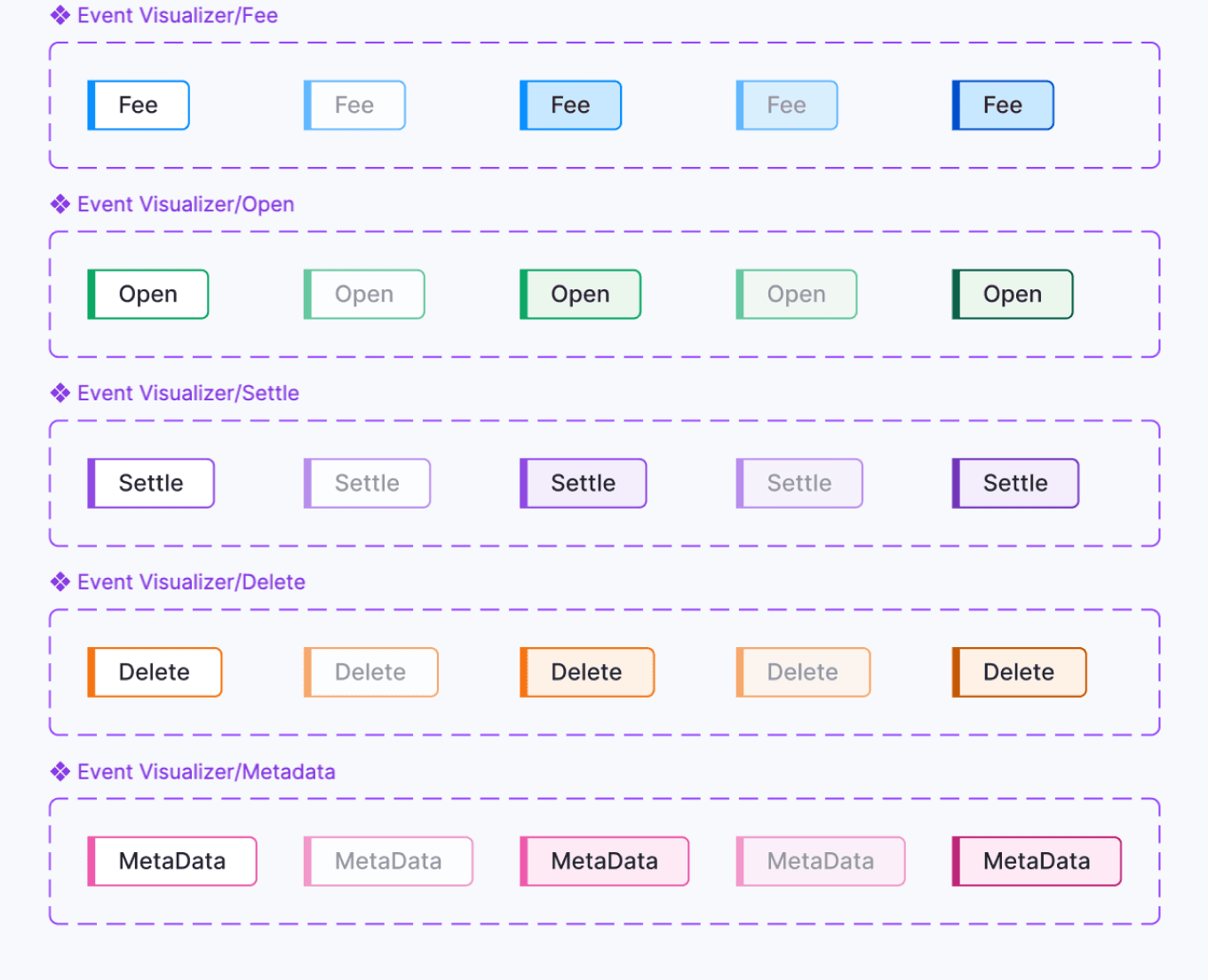
Timeline iteration
Inspired by the engineer’s prototype and analysis, I designed a new timeline component and introduced status indicators for each event chip.
Default
Hidden
Hover_D
Hover_H
Pressed
Visualizer-EntryTS
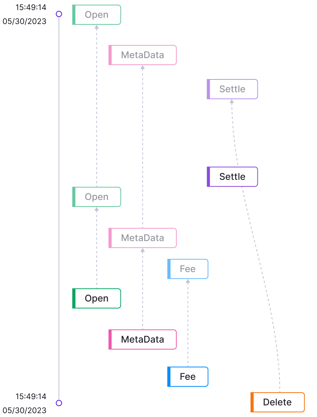
Visualizer-AsOfTS
Hover on Events
Hover on links
Event visualizer
Users can hover over chips or links to view event details and relationships. They can also switch tabs to focus on a single type of event.
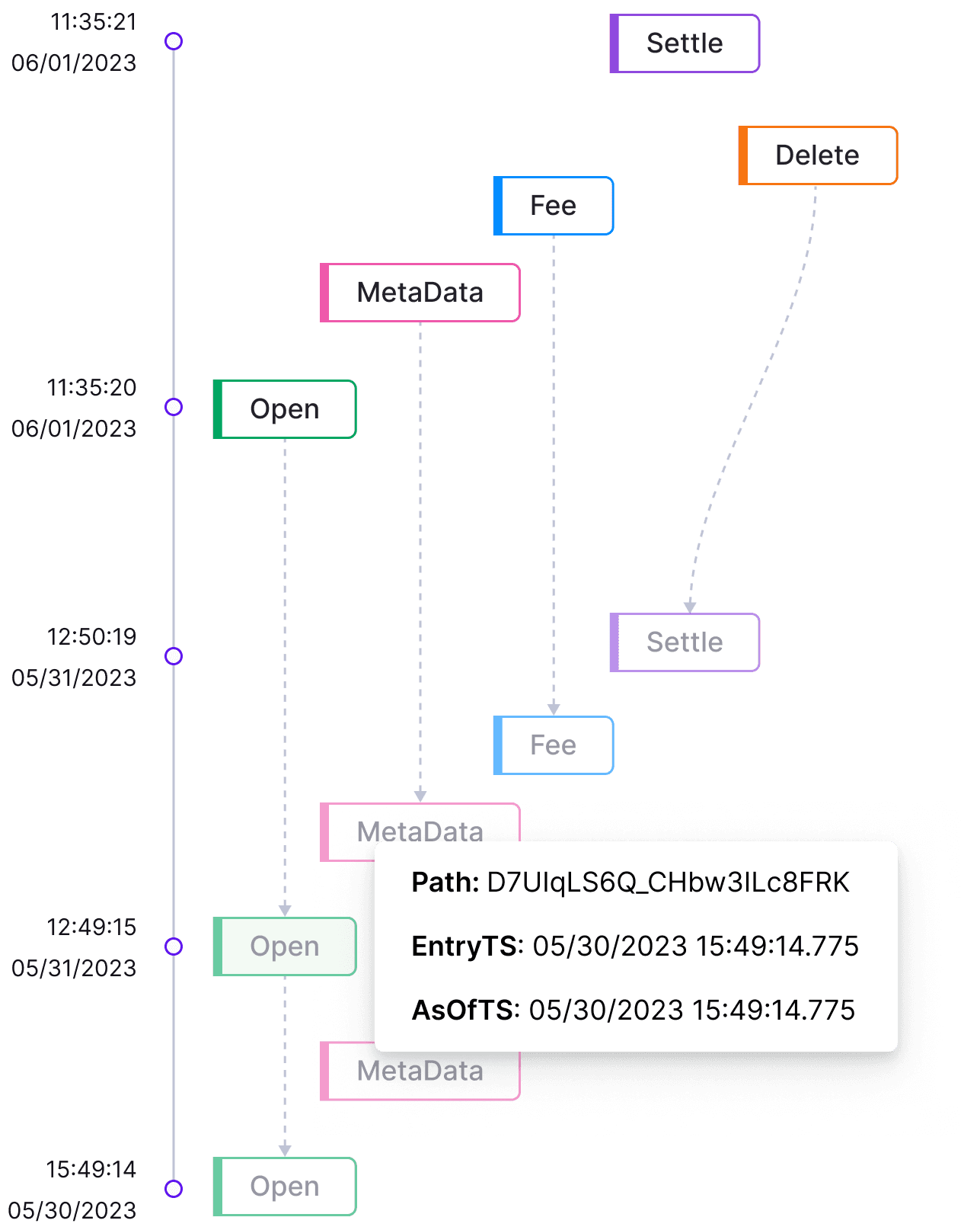
Event positions
Users can click the “View Positions” button or an event chip to explore how each event—or all events up to that point—impacts positions.
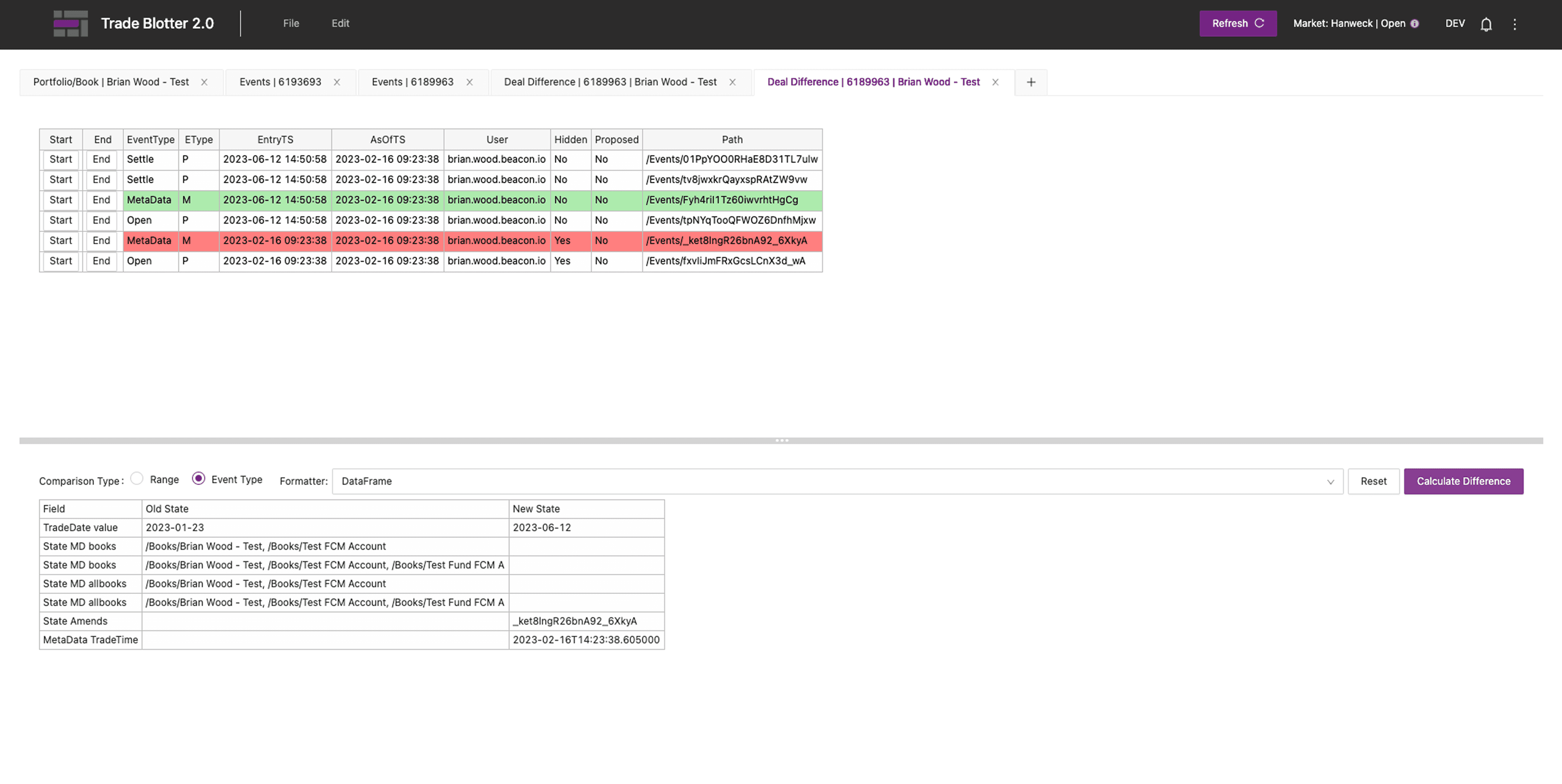
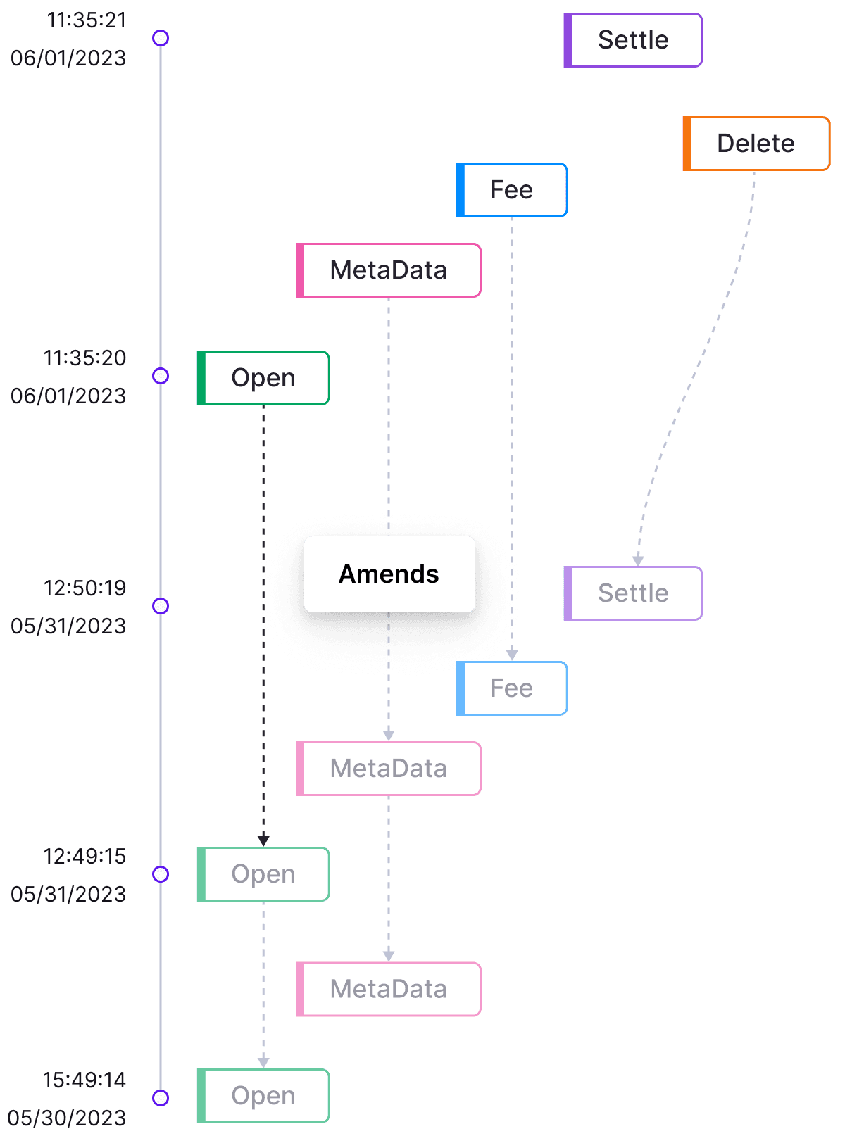
Deal difference
Users can simply select two rows using checkboxes and click the “Deal Difference” button. A comparison tab then opens, displaying deal details side by side with highlighted differences for quick analysis.
Dark Theme
Impact
clearer relationships & audibility
“I can finally line up two events and see what actually changed without digging through three screens.”
— Client User
“Our Trade Blotter is getting better and better thanks to our designers, clients loves it!”
— Beacon CEO
Reflection
What I learned
Share early, iterate often
Presenting design ideas early invited valuable feedback and cross-functional alignment. Collaborating with engineers brought fresh insights and technical inspiration.
Partner with PMs to learn fast
Working closely with product managers helped me quickly ramp up on complex domain knowledge. I also leveraged AI tools to understand financial terminology more efficiently.
Balance density and clarity
A compact data table can improve information density, but data visualization often communicates insights more intuitively.
User-centered design
In the financial domain, speed and efficiency are key. Designing for users’ real workflows ensures clarity, confidence, and trust.